
Humans strive for beauty everywhere, and they do so in multiple ways. Some people seek beauty in views and tend to keep it forever by taking pictures or even painting the whole view. Some do this by creating melodies that live and mesmerize people for centuries. With striving for beauty and art in everything, it is no surprise that we do for apps as well. Apps are not always about functions and features; you can think of them as pieces of art that take much time, detail, and effort to perfect and complete. However, this doesn’t erase the fact that they should be functional as well. Now this can be a bit confusing: should an app be a piece of art, or should it be usable? That is what we are going to learn in this article. In this article, we will explore the aesthetic-usability effect, which helps developers achieve balance. We will also explore ways that they could do so effectively.
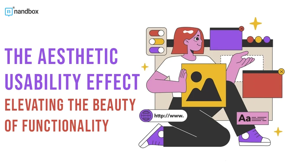
What is the Aesthetic-Usability Effect and How Did It Start?
Aesthetics and usability are two important parts of a major establishment and process that have many perspectives and prospects. The aesthetic-usability effect can be considered a cherished law of UI and UX, as it is the main aim of any developer and designer. The term originated in 1995 by researchers Masaaki Kurosu and Kaori Kashimura. Both started to explore the correlation between the two concepts and the impact they had on each other. They decided to dig deep and validate their theory by experimenting with users with different types of software and different cases of different usability and aesthetic ratios. This study helped us develop one of the most crucial strategies of UI/UX design for software, websites, and applications. The aesthetic-usability effect states that users always search for visuals and aesthetics in all applications. Also, aesthetics always impact the degree to which a user can perceive the usability of an application. So, for instance, if an application is aesthetically pleasing, a user might perceive the application as easy to use. Thus, it confirms that aesthetics are major influencers.
Importance of Implementing Visuals and Aesthetics in Applications
Implementing visuals and aesthetics in applications is crucial for several reasons:
Enhanced User Experience (UX)

Visual elements greatly impact how users interact with and perceive an application. Well-designed visuals improve usability and make the user experience more intuitive and enjoyable.
Engagement and Retention
Aesthetically pleasing applications tend to attract and retain users better. The use of colors, graphics, and layouts can capture attention and encourage users to explore the app further.
Branding and Recognition
Consistent visual design elements help create a strong brand identity. A well-designed app with a cohesive aesthetic reflects positively on the brand and makes it more recognizable.
Communication and Clarity
Visuals can often serve as more effective communicators than words alone. Infographics, icons, and imagery can help to clarify complex concepts and guide users through the app more easily.
Differentiation in a Competitive Market
In a crowded app market, good design can be a key differentiator. Users are drawn to apps that are visually appealing and intuitive, especially when they offer similar functionalities to other apps.
Accessibility and Inclusivity
Thoughtful design considers various user needs, including those with disabilities. Using appropriate visuals, colors, and layouts can make an app more accessible to a wider audience.
Emotional Connection
Aesthetics can evoke emotions and create a connection between the user and the app. This emotional bond often leads to increased user loyalty and advocacy.
Usability and Navigation
Visual design elements can significantly impact how easily users can navigate an app. Clear layouts, intuitive buttons, and well-placed visual cues aid in smooth navigation.
Beauty is Deceiving: Can Prioritizing Aesthetics Harm Your Application?
The old saying “beauty is deceiving” implies that one should not place too much stock on outward appearances. This idea is particularly true in the field of applications and software, where putting aesthetics first might have undesirable results. In today’s visually oriented world, the design, presentation, and user experience of an application or digital product are crucial. Designs that are pleasing to the eyes tend to have a greater chance of attracting people, making a good first impression, and improving the overall usability of a product. However, it’s important to remember that focusing too much on how something looks might be harmful to the application’s functionality as a whole. Several potential problems can occur when aesthetics are given too much weight, such as:
Neglect of Functionality
If aesthetics are prioritized over usability, the end product’s app may be aesthetically pleasing but difficult to use or lacking in key functions. There’s a chance that users may get frustrated trying to figure out how to use the application, and it won’t end well.
Performance Issues
Including too many high-resolution pictures, complicated animations, or other visual features can slow down an application. Particularly on low-powered or old devices, this might increase loading times, eat up resources, and provide a negative user experience.
Accessibility Challenges
It’s possible that users who have impairments won’t be able to use an application with outstanding visuals. Beautiful but complicated interfaces can turn off users who rely on assistive technologies or have other accessibility requirements if they are not carefully built.
Maintenance and Updates
Complex layouts increase the difficulty of ongoing support and enhancements to applications. More time and energy may be needed for updating or altering a system with sophisticated aesthetics, which could delay or complicate the implementation of necessary adjustments or fixes.
Cost Implications
The development cost could rise dramatically if complicated and aesthetically pleasing designs are implemented. Overspending is possible if more resources are put into aesthetics at the expense of other essential functionalities.
Apps With the Best Aesthetic-Usability
Waze
Waze is a popular navigation application known for its pleasing interface. The app successfully achieved the tough equation of having an application that benefits people while also being appealing. The advanced navigation features and capabilities, accompanied by the visuals and intuitive interface, make Waze the ideal example of the aesthetic-usability effect.

Instagram is well-known for its aesthetically attractive design, which mixes stunning images with a simple interface. Its user-friendliness, ease of use, and emphasis on visuals make it a popular choice. Its practicality and usability stem, in part, from the fact that it is so straightforwardly built. All of this makes it logical that millions of users around the world favor Instagram.
Aesthetic and Usability, Perfectly Balanced, As All Things Should Be: Achieving The Aesthetic-Usability Effect 101
The above examples didn’t happen to exist perfectly and free of flaws. Achieving this consistency among all the apps and their elements is a tough and endless process that developers and designers stuck in forever. However, this process can get easier by applying some techniques and strategies. So, how about we explore a few?
1. Minimal All The Way
Minimalism is a key to success, especially for apps. Some apps follow the direction of the more, the better when it comes to adding elements and visuals. Little did they know that this was not always the answer. With the rise of new design strategies like neumorphism that proved their effectiveness, the minimal direction has been widely used. Going minimal includes adding only the necessary elements and visuals to create a spacious and organized interface that enhances usability.
2. Choose Your Colors Well
The second strategy for achieving the aesthetic-usability effect is choosing a color scheme. Choosing a well-organized and harmonic color scheme helps elevate the user experience and achieve great satisfaction. Colors mean consistency, which is a major factor in achieving balance. Not only does it help establish a great look and interface, but it also elicits positive emotions from users, thus leading to positive reviews and experiences.
3. Implement White Spaces
The last effective strategy that could help you achieve an aesthetic and usability balance is implementing white spaces. White spaces are blanks or empty spaces left in app pages or surrounding elements. They are also called negative spaces as they have no actual functions. Despite having no functions, white spaces are powerful elements of UI designs. White spaces with all their types—active, passive, micro, or macro—help enhance the visual clarity as well as the usability of an application. This is because they facilitate interactions with features or UI elements and improve readability. Therefore, it makes the user’s experience more clear and enjoyable.
En Fin
Finding an equilibrium between appearance and functionality is crucial. Visual attractiveness is important for enticing users, but it shouldn’t take priority over the app’s actual functionality. A well-executed design should do more than just look nice; it should also increase the app’s usability and make it easier to use. Achieving balance should always be a number one priority, as it is what all developers and designers aim for. Striving for beauty alone is not enough to live a practical life, so always strive for balance.